Calibrating Marketing Mix Models with Geo-Experiments
We estimate the MMM parameters from geo-experiments, using all the information they provide.
Published
August 20, 2026
Introduction
The previous post ended on an uncomfortable result. A Marketing Mix Model, honestly specified and cleanly converged, estimated the return on paid search (PLA) at 11.5x against a true 4.2x — and handing it perfect controls only brought the estimate down to 9.8x, still more than double the truth. The diagnosis was not a modelling flaw but a property of the data: PLA spend was set by planners and algorithms reacting to the same demand that drives sales, so spend never varied independently of demand, and no amount of historical data contains the information that identifies its effect. Estimated on observational data alone, a Marketing Mix Model cannot in general recover the true effects of marketing.
This post turns to another source of variation: marketing A/B tests and geo-experiments, which many companies run. A geo-experiment randomly splits the regions of a country into two groups, a treatment group and a control group. Given enough regions, chance makes the two groups comparable, and we can partly verify this: when we examine past sales of the two groups, the two series should track each other closely. To measure the effect of marketing, a channel is then switched off for a few weeks — but only in the treatment group; in the control group, everything continues as before. Because the two groups are otherwise fully comparable, any difference in sales that emerges between them is due to the effect of marketing.
The idea of using experiments to calibrate Marketing Mix Models has existed for some time (as described here and here). Standard practice first compresses each experiment into a single number: the incremental sales due to marketing, as measured by the experiment, per euro spent on marketing. This is also referred to as ‘return on ad spend’ (ROAS). This number is then added to the likelihood when estimating the MMM from observational time series, rewarding the Bayesian model for parameter estimates that match the ROAS. Compared to uncalibrated MMM, the approach has been a step forward, but it does not take advantage of all the information available. The time series from an experiment (for the treatment and control groups) contain far more information — enough to estimate the MMM’s complete parameter set for the tested channel: carryover \(\alpha\), saturation \(\lambda\), and effectiveness \(\beta\).
This post shows how to estimate these parameters directly from the experimental time series. The approach is, to my knowledge, new; it is the subject of my companion paper, Structural Estimation of Marketing Mix Model Parameters from Geo-Experiments(on arXiv), which carries the formal identification argument and a fuller set of results. This post is the hands-on version and stands on its own.
Setting up the environment
We start by setting up the environment. As in the previous posts, the plotting functions live in a separate helper file (mmm3_helpers.py) to avoid clutter; everything else happens in this post.
import numpy as npimport pandas as pdimport pymc as pmimport pytensor.tensor as ptimport arviz as azimport matplotlib.pyplot as plt# The plotting functions live in a helper file with the same visual# conventions as the earlier posts, so the figures read as one seriesfrom mmm3_helpers import ( visualize_test_calendar, visualize_geo_test, visualize_parameter_posteriors, visualize_joint_posteriors, visualize_identified_response_curve, visualize_method_comparison,)plt.rcParams.update({'axes.spines.top': False, 'axes.spines.right': False,'axes.grid': True, 'grid.color': '0.92', 'grid.linewidth': 0.6,'axes.axisbelow': True, 'axes.titlelocation': 'left','axes.titleweight': 'normal', 'axes.titlesize': 10.5,})L_MAX =6RANDOM_SEED =42np.random.seed(RANDOM_SEED)df = pd.read_csv('synthetic_mmm_data.csv') # from the synthetic-data postTRUE_ROAS_PLA = df['pla_effect'].sum() / df['pla_spend'].sum()print(f"{len(df)} weeks; true PLA ROAS = {TRUE_ROAS_PLA:.2f}x")# The same column maxima the estimation post scaled byscale_factors = {'total_sales': float(df['total_sales'].max()),'pla_spend': float(df['pla_spend'].max()),}scale_factors
We continue with the synthetic dataset from the earlier posts, so we have both realistic sales and marketing series and know the true effects to compare our estimates against. What is new is the geo-experiment on top of it.
The design we simulate is a go-dark test: the treatment regions stop spending on the tested marketing channel entirely for the duration of the test, while the control regions continue as usual. Simulating this in our synthetic world is easy: we take the country-level time series and create two parallel universes.
In the control universe nothing changes: We use our synthetic dataset as is.
In the treatment universe, marketing spend on product listing ads (PLA) is set to zero during the geo-test, and the PLA channel’s effect on sales is recomputed with exactly the adstock and saturation transformations that built the data in the first post.
Three parts of the implementation deserve a note:
Scaling. To replicate the data of an actual geo-experiment we should scale both series by 0.5, for a 50–50 split of the country. We skip this and keep both universes at the scale of the whole country, as if treatment and control each covered the entire market. This spares us the bookkeeping between market-level and test-group level units: the parameters we estimate live on the country scale and can be compared to those of the MMM directly.
An imperfect split. Randomisation makes the two groups comparable, not identical. Week to week, a little more demand happens to land in one group and a little less in the other — and since the country’s total is whatever it is, these idiosyncratic differences are opposite-signed by construction. We simulate them as opposite-signed noise on the two sales series, sized at one percent of average sales and running over the entire history, not only during the tests. This means that even though the treatment and control groups are fully comparable, sales differ a little week-to-week due to random variation. (We keep these differences independent across weeks; in reality they can persist.)
Carryover in the simulated data. Going dark during the test also changes adstock in the weeks after the test, since adstock is a function of past spend; and in the first dark week, adstock does not drop to zero at once. We therefore set spend to zero in the test windows and recompute adstock and the channel’s effect over the entire series, not over the windows alone.
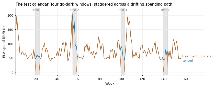
We simulate four go-dark tests for PLA, each with four dark weeks, four pre-test weeks and eight cooldown weeks of measurement. The windows are spaced further apart than the adstock memory, so no test’s carryover reaches the next test’s measurement window. The staggering is deliberate: because spend levels vary over the three years, tests run at different times are tests run at different spending levels — and, as we will see, that variation across levels is what identifies the saturation curve.
TEST_DURATION, PRE_WEEKS, POST_WEEKS =4, 4, 8test_calendar = pd.DataFrame({'test_id': [1, 2, 3, 4],'test_start_week': [20, 55, 100, 140],'noise_seed': [10, 20, 30, 40],})test_calendar['test_end_week'] = (test_calendar['test_start_week']+ TEST_DURATION -1)def create_parallel_universes(dataset, test_calendar, test_channel='pla', noise_share=0.01, noise_seed=42):""" A go-dark geo-test as two parallel universes, both at country scale. The control universe is the dataset as planned. In the treatment universe the tested channel goes dark during every window of the test calendar, and its effect is recomputed once, over the full history, so carryover into and out of every window is correct. The other channels are untouched, so total sales only needs the tested channel's contribution swapped. The two groups are comparable, not identical: week to week, a little more demand lands in one group's regions and a little less in the other's. At country scale this appears as opposite-signed noise on observed sales, running over the whole history — not only during tests. """ np.random.seed(noise_seed) config = CHANNEL_CONFIGS[test_channel]# The treatment universe differs in one channel only dark_weeks = np.zeros(len(dataset), dtype=bool)for test in test_calendar.itertuples(): dark_weeks |= dataset['week'].between(test.test_start_week, test.test_end_week).values dark_spend = dataset[f'{test_channel}_spend'].mask(dark_weeks, 0.0) dark_effect = config['coefficient'] * logistic_saturation( geometric_adstock(dark_spend.values, config['adstock_rate'], L_MAX), config['saturation_lambda']) control = dataset.copy() treatment = dataset.assign(**{f'{test_channel}_spend': dark_spend,f'{test_channel}_effect': dark_effect,'total_sales': dataset['total_sales']- dataset[f'{test_channel}_effect'] + dark_effect, })# The imperfect split: idiosyncratic, opposite-signed weekly differences noise = np.random.normal(0, noise_share * dataset['total_sales'].mean(),len(dataset)) control['sales'] = control['total_sales'] + noise treatment['sales'] = treatment['total_sales'] - noise control['region'], treatment['region'] ='control', 'treatment'return control, treatmentcontrol_universe, treatment_universe = create_parallel_universes(df, test_calendar)
The picture below shows our geo-tests and their design: the treatment universe’s PLA spend drops to zero in each of the four windows, while the control universe continues to spend as normal — visibly at different levels in different windows.
The dataset for one geo-test is deliberately minimal: the week, the group, the phase of the test, the tested channel’s spend, and observed sales — the columns that a real experiment would hand us, with the pre-test and cooldown weeks part of the measurement. The one exception is pla_effect, the channel’s true contribution, which we carry along only so that we also draw the truth in the figures below.
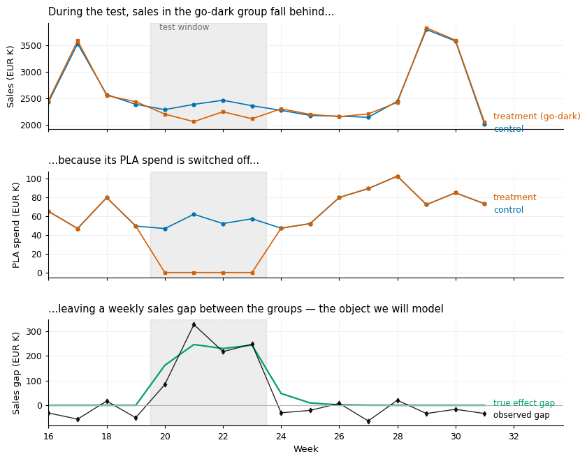
With the datasets in hand, we look at what one experiment shows. The figure below plots the first test. The top panel shows the check promised in the introduction: outside the test window, sales in the two groups track each other closely, and during the test the go-dark group falls behind. The middle panel shows the intervention itself — PLA spend, identical in both groups except where it is switched off. The bottom panel shows the weekly sales gap between the groups, which is the object we will model, together with the true effect gap, known here because the data is synthetic.
visualize_geo_test(geo_tests[0])
The edges of the gap panel deserve a word — at least in principle. The gap should not open to its full size in the first test week, because carryover from pre-test advertising still supports sales in the treatment group; and after the test it should not close at once, but fade over the cooldown weeks. The pace of that opening and closing is the carryover parameter: this is where the experiment traces \(\alpha\). In our data the transitions are hard to see because PLA’s carryover is short (\(\alpha = 0.2\)), so they play out within about a week, and the week-to-week noise between the groups is of a similar size. The signal is faint rather than absent — the model below will pool it across every transition of every test — but it is not something to point at in this figure.
The one-number reading
Standard practice, as described in the introduction, compresses all of this into a single number per test: the total sales gap between the groups, divided by the total spend gap over the test window. Two versions of the count are worth computing: one takes only the sales gap in the test window; the other also counts the cooldown weeks — methodologically the more correct reading, since carryover means some of the effect arrives after the window. Applied to our four tests:
Test 1: one-number ROAS 4.02x, including cooldown 3.25x (true 4.20x)
Test 2: one-number ROAS 3.83x, including cooldown 4.08x (true 4.20x)
Test 3: one-number ROAS 3.57x, including cooldown 3.69x (true 4.20x)
Test 4: one-number ROAS 3.71x, including cooldown 3.92x (true 4.20x)
In my run the window-only numbers land between 3.57x and 4.02x, against a truth of 4.20x: close, a touch low, and scattered. The shortfall and the scatter both have causes. Each number misses the roughly 6% of the effect that carryover pushes past the window’s edge; each measures the return at the spending level of its own test rather than the three-year average; and the week-to-week noise between the groups does the rest. Including the cooldown repairs the first of these — though with PLA’s short memory, a week or two would recover almost all of it. The version computed above counts all eight cooldown weeks instead, most of which add nothing but noise to the numerator, and the numbers duly scatter more widely, from 3.25x to 4.08x. How to trade the two off depends on the carryover — which is precisely what a single number per test cannot estimate.
And that is the general problem with the compression. Averaging the numbers gives a serviceable overall ROAS, and this is roughly where good current practice stops; but even a good single number cannot say how fast the effects decay or how the return would change at a different spending level. That information is present in the gap panel above; the summation retains none of it.
Step 3: The differencing equation
The route from the experiment to the model’s parameters is a single subtraction. It is worth taking slowly, because it is the whole method.
Start from the previous post. There we wrote weekly sales in the canonical MMM formulation: a baseline, plus one term per marketing channel, plus controls and seasonality, plus noise:
so that three parameters per channel — \(\alpha_m\), \(\lambda_m\), \(\beta_m\) — govern how its spend becomes sales. This is the equation we estimated on three years of observational data, and for PLA the estimate came back confidently wrong: nothing in that data separates the sales that caused the spend from the sales the spend caused.
Now write this same equation twice — once for the control universe, once for the treatment universe. Because we kept both universes at the scale of the whole country in Step 1, the country-level equation applies to each of them exactly as it stands, with the same parameters; no unit conversion is needed. (In a real experiment, this is what scaling each group’s series up to country level buys.) Then go through the right-hand side term by term and ask: which terms differ between the two universes?
The baseline \(\beta_0\): the same in both.
Meta and TV: their spends were never touched by the experiment, so their adstocks, their saturations, and their contributions are identical in both universes, week by week.
Controls and seasonality: the same calendar, the same promotions, the same prices on both sides.
And everything the equation does not contain — the sentiment and quality drifts that undid the observational estimates: the same too, because randomisation made the two groups comparable. This is what the experimental design was for.
The only term that differs between the universes is PLA’s, because PLA spend is the one thing the experiment changed. So collect everything shared into a single symbol, \(\mu_t\), and the two universes read:
where \(x^*_t\) is PLA’s adstocked spend in each universe — it contains \(\alpha\) — and \(\mu_t\) is everything else: the baseline, the other channels, the calendar, and every demand factor, observed or not, modelled or not. We never need to know what is inside \(\mu_t\); it only needs to be the same in both universes. Because it is, subtracting the second line from the first removes it:
Everything that made the observational problem hard has dropped out: the baseline is gone, Meta and TV are gone, the calendar is gone, and — the part no amount of extra data or better controls could deliver — the unobserved confounders are gone too, not because we measured them, but because randomisation put the same amount of them on both sides of the subtraction. What remains relates observed quantities — the weekly gap on the left, the two spend paths inside the adstocks on the right — to exactly the three parameters we want. The remaining noise, \(\nu_t = \varepsilon_t^{c} - \varepsilon_t^{tr}\), is the imperfect split from Step 1: the idiosyncratic weekly differences between two comparable groups.
Step 4: The model
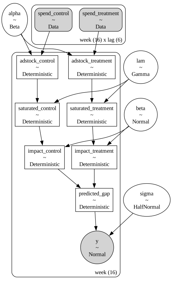
The Bayesian model is the differencing equation, written out in PyMC. Reading the equation tells us what the model must contain. Spend enters twice, once per universe. Both spend paths then pass through the same transformations as in the previous post — adstock, then saturation — with a single set of parameters \((\alpha, \lambda, \beta)\) shared between the two universes and across all tests: the experiment changed the spend, not how the channel works. The model’s prediction for a week is the difference between the two contributions, and the observed treatment-control gap scatters around this prediction with some noise.
def build_structural_model(control_lags, treatment_lags, y_observed):"""The differencing equation as a PyMC model: two spend paths through one shared adstock and saturation; the likelihood sits on the weekly gap.""" coords = {'week': np.arange(len(y_observed)), 'lag': np.arange(L_MAX)}with pm.Model(coords=coords) as model:# One shared parameter set for both universes adstock_alpha = pm.Beta('alpha', alpha=2, beta=1) saturation_lambda = pm.Gamma('lam', alpha=2, beta=1) beta = pm.Normal('beta', mu=0, sigma=0.5) sigma = pm.HalfNormal('sigma', sigma=0.5)# The spends enter as data: current + lagged, per week, per universe spend_control = pm.Data('spend_control', control_lags, dims=('week', 'lag')) spend_treatment = pm.Data('spend_treatment', treatment_lags, dims=('week', 'lag')) decay_weights = pt.power(adstock_alpha, pt.arange(L_MAX)) decay_weights = decay_weights / pt.sum(decay_weights)def contribution(group, lagged_spends):"""Spend -> adstock -> saturation -> contribution: the MMM's transformation chain, applied identically to either universe.""" adstock = pm.Deterministic(f'adstock_{group}', pt.sum(lagged_spends * decay_weights, axis=1), dims='week') saturated = pm.Deterministic(f'saturated_{group}', (1- pt.exp(-saturation_lambda * adstock))/ (1+ pt.exp(-saturation_lambda * adstock)), dims='week')return pm.Deterministic(f'impact_{group}', beta * saturated, dims='week') predicted_gap = pm.Deterministic('predicted_gap', contribution('control', spend_control)- contribution('treatment', spend_treatment), dims='week') pm.Normal('y', mu=predicted_gap, sigma=sigma, observed=y_observed, dims='week')return model
As in the previous post, the easiest way to read the model is to draw it. The diagram shows only the model’s structure, not any numbers, so we do not need data yet: instantiating the model on an empty placeholder of the right shape is enough to draw it.
n_weeks = PRE_WEEKS + TEST_DURATION + POST_WEEKS # one test's worth of weeksplaceholder = build_structural_model( control_lags=np.zeros((n_weeks, L_MAX)), treatment_lags=np.zeros((n_weeks, L_MAX)), y_observed=np.zeros(n_weeks))pm.model_to_graphviz(placeholder)
Reading the diagram top to bottom: the spends enter as data — for every week, the current and five lagged spends of each universe. Each universe’s spends then go through the two transformations of the MMM: \(\alpha\) determines the adstock, \(\lambda\) the saturation, and \(\beta\) converts the result into the channel’s contribution to sales. Note that the parameters sit outside the plate: there is one \(\alpha\), one \(\lambda\) and one \(\beta\), applied to both universes and to every week of every test. predicted_gap is the difference between the two contributions. And the shaded node at the bottom — what the model conditions on — is not sales, as in the previous post, but the weekly gap between the groups: the quantity that the differencing equation showed to be free of confounding.
The priors are the same as in the previous post: Beta(2, 1) for the carryover, Gamma(2, 1) for the saturation, Normal(0, 0.5) for the coefficient, and HalfNormal(0.5) for the noise of the differenced series. Using the same priors in both posts keeps the comparison clean: whatever differs between the estimates, it is not the priors. (The companion paper uses pymc-marketing’s default priors instead, with the same results; nothing here depends on the prior.)
Step 5: Preparing the data
The model is precise about the data it needs: for every week, the observed gap on the left-hand side and, on the right, the current and the \(L-1\) previous spends of each universe, from which it builds the adstock. We now reshape the geo-test datasets accordingly — as in the estimation post, into wide format. Each row is one week of one experiment, and it carries two things: the week’s sales gap (sales are observed in both groups, so the difference is a simple subtraction), and six weeks of spend per universe — the week’s own spend plus the five before it, looked up from the full spend histories. The lagged spends repeat what earlier rows already contain, but that repetition is the point: it makes each row self-contained, so pooling tests is nothing more than stacking their rows. Everything is placed on the MMM’s scale by dividing by the same column maxima as before. The preview below shows the result for the first test: the same information as the long-format dataset of Step 1, just reshaped much wider.
def reshape_data(geo_test, control_spend_full, treatment_spend_full, l_max=L_MAX):"""One row per measured week: the sales gap, plus current and lagged spends of both universes, everything on the MMM's scale.""" control = geo_test[geo_test['region'] =='control'].sort_values('week') treatment = geo_test[geo_test['region'] =='treatment'].sort_values('week') weeks = control['week'].valuesif weeks.min() - (l_max -1) <1:raiseValueError("Not enough spend history before the test ""to build the lagged spends.") wide = pd.DataFrame({'week': weeks,'period': control['period'].values,'y': (control['sales'].values - treatment['sales'].values)/ scale_factors['total_sales'], })for lag inrange(l_max): wide[f'control_spend_lag{lag}'] = ( control_spend_full[weeks -1- lag] / scale_factors['pla_spend']) wide[f'treatment_spend_lag{lag}'] = ( treatment_spend_full[weeks -1- lag] / scale_factors['pla_spend'])return wideprepared = [reshape_data(test, df['pla_spend'].values, treatment_universe['pla_spend'].values)for test in geo_tests]data_2tests = pd.concat(prepared[:2], ignore_index=True)data_4tests = pd.concat(prepared, ignore_index=True)print(f"2 tests: {len(data_2tests)} weekly observations; 4 tests: {len(data_4tests)}")prepared[0].round(3).head()
2 tests: 32 weekly observations; 4 tests: 64
week
period
y
control_spend_lag0
treatment_spend_lag0
control_spend_lag1
treatment_spend_lag1
control_spend_lag2
treatment_spend_lag2
control_spend_lag3
treatment_spend_lag3
control_spend_lag4
treatment_spend_lag4
control_spend_lag5
treatment_spend_lag5
0
16
pre
-0.005
0.304
0.304
0.266
0.266
0.268
0.268
0.231
0.231
0.222
0.222
0.275
0.275
1
17
pre
-0.009
0.219
0.219
0.304
0.304
0.266
0.266
0.268
0.268
0.231
0.231
0.222
0.222
2
18
pre
0.003
0.373
0.373
0.219
0.219
0.304
0.304
0.266
0.266
0.268
0.268
0.231
0.231
3
19
pre
-0.008
0.231
0.231
0.373
0.373
0.219
0.219
0.304
0.304
0.266
0.266
0.268
0.268
4
20
test
0.014
0.218
0.000
0.231
0.231
0.373
0.373
0.219
0.219
0.304
0.304
0.266
0.266
Step 6: Estimating the model
With the model structure and the data in place, we can now estimate the model. There is one bit of glue in worth pointing out in fit_structural: we collect the lagged spend columns of the wide table into one week-by-lag matrix per universe — as this is the format that the model expects — before actually estimating the model. For sampling, we use the same settings as in the previous post: NUTS, four chains, target_accept = 0.95, and 2,000 draws after 1,000 tuning steps. We estimate the model twice, once on the first two tests and once on all four, to see how much the additional experiments improve the estimates. Below we show the summary of the four-test estimation; the two-test one passes the same checks. The r_hat and ESS values clear the convergence bar of the previous post — but, as discussed there, this only tells us that the sampling worked. Whether the estimates are any good is the question for the rest of the post.
def fit_structural(wide, seed=RANDOM_SEED, draws=2000, tune=1000):# The lag columns of the wide table, collected into one (week x lag)# matrix per universe — a change of format, not of information control_lags = wide.filter(like='control_spend_lag').values treatment_lags = wide.filter(like='treatment_spend_lag').valueswith build_structural_model(control_lags, treatment_lags, wide['y'].values): idata = pm.sample(draws=draws, tune=tune, chains=4, target_accept=0.95, random_seed=seed, return_inferencedata=True)return idatatrace_2 = fit_structural(data_2tests, seed=RANDOM_SEED)trace_4 = fit_structural(data_4tests, seed=RANDOM_SEED +1)az.summary(trace_4, var_names=['alpha', 'lam', 'beta', 'sigma'])
Initializing NUTS using jitter+adapt_diag...
Multiprocess sampling (4 chains in 4 jobs)
NUTS: [alpha, lam, beta, sigma]
Sampling 4 chains for 1_000 tune and 2_000 draw iterations (4_000 + 8_000 draws total) took 8 seconds.
There were 4 divergences after tuning. Increase `target_accept` or reparameterize.
Initializing NUTS using jitter+adapt_diag...
Multiprocess sampling (4 chains in 4 jobs)
NUTS: [alpha, lam, beta, sigma]
Sampling 4 chains for 1_000 tune and 2_000 draw iterations (4_000 + 8_000 draws total) took 8 seconds.
There were 1 divergences after tuning. Increase `target_accept` or reparameterize.
mean
sd
hdi_3%
hdi_97%
mcse_mean
mcse_sd
ess_bulk
ess_tail
r_hat
alpha
0.165
0.048
0.076
0.258
0.001
0.001
3749.0
2935.0
1.0
lam
0.859
0.390
0.246
1.553
0.008
0.006
1839.0
2142.0
1.0
beta
0.414
0.204
0.144
0.801
0.005
0.006
1834.0
2053.0
1.0
sigma
0.008
0.001
0.007
0.009
0.000
0.000
3662.0
3365.0
1.0
Step 7: Reading the results
How should we judge the estimates? The previous post made the case that the individual parameters are the wrong place to start: \(\lambda\) and \(\beta\) are only weakly identified, because different combinations of the two fit the data almost equally well — they trade off along a ridge, which we will see directly later in this section. What is well identified is what the parameters jointly imply. So we start there, with the most important implied quantity: the ROAS.
The calculation is simple. Every posterior draw is one candidate set of parameters \((\alpha, \lambda, \beta)\). For each draw, we apply these parameters to the actual PLA spend of the past three years — adstock, saturation, coefficient — which gives the incremental sales this draw implies; dividing by the spend gives its ROAS. Doing this for every draw yields a distribution: our estimate of the average ROAS over the full three years, not just over the test windows. This is the same quantity the previous post estimated with the MMM, so the numbers of the two posts are directly comparable. And because the ROAS is computed draw by draw, the correlation between the parameters is carried into the interval automatically.
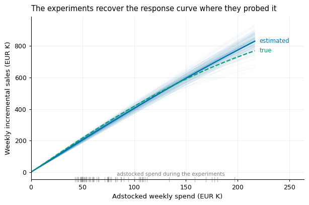
The response curve shows the same result in the units that matter for budget decisions. Over the range of adstocked spend that the experiments covered — the rug at the foot of the figure — the estimated curve lies on top of the true one. Because the tests were staggered and ran at different spending levels, this range is wide: in this run it spans roughly EUR 40K to EUR 200K, almost the entire range observed in the three years of data, so the curve is well estimated everywhere the company has actually operated. Beyond it, the posterior draws fan out. The reason is the same weak identification as before: many parameter combinations produce nearly the same curve over the covered range — which is why the data cannot tell them apart — but these combinations increasingly disagree as the curve is extended beyond it. Within the tested range this ambiguity is harmless; outside it, the fan shows honestly how little the experiments say about spending levels that nobody has tried.
experiment_weeks = np.concatenate( [test.loc[test['region'] =='control', 'week'].values for test in geo_tests])visualize_identified_response_curve( trace_4, spend=df['pla_spend'].values, scale_factors=scale_factors, true_config=CHANNEL_CONFIGS['pla'], adstock_fn=geometric_adstock, saturation_fn=logistic_saturation, experiment_weeks=experiment_weeks)
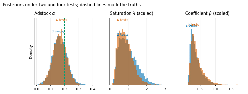
Only now do we look at the parameters themselves. The scaled truths to compare against are \(\alpha = 0.20\), \(\lambda \approx 1.71\), \(\beta \approx 0.18\). As we have just seen, what the parameters jointly imply is estimated well; the individual parameters are a different story. The carryover comes out about right: the posterior centres near 0.17 and the truth of 0.20 lies well inside, though the posterior is not narrow — only a handful of transition weeks per test carry information about \(\alpha\). For \(\lambda\) and \(\beta\) the picture is more interesting. Their posteriors point to a flatter saturation curve with a larger coefficient than the truth — with four tests, the 90% intervals of both just exclude the true values — and yet the ROAS above is accurate. This is possible because the data cannot separate \(\lambda\) from \(\beta\), only their joint implication: the estimates can drift along the ridge, but everything the ridge preserves — the response curve over the tested range, and with it the ROAS — remains correct. Adding tests also does little for the individual parameters: from two tests to four, \(\lambda\)’s interval narrows by about a fifth, while \(\alpha\)’s and \(\beta\)’s barely change. None of this is a weakness of the estimator; it is simply how much a few short experiments can say about individual parameters — and the reason we judged on the ROAS first.
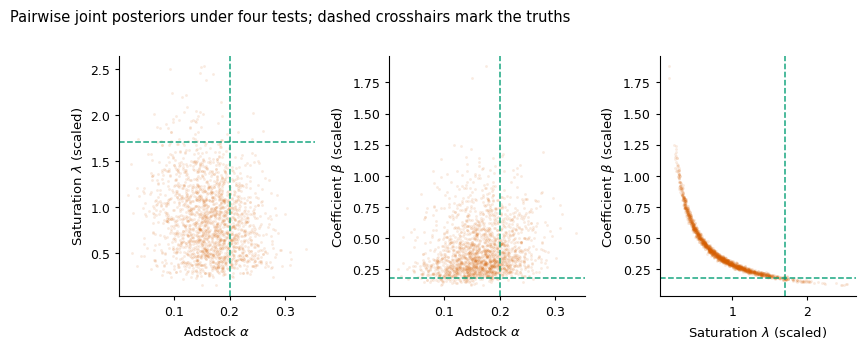
We can also draw this trade-off directly. The figure below shows the pairwise joint posteriors of the three parameters, estimated on four tests. The \(\lambda\)–\(\beta\) panel is the important one: the posterior forms a narrow ridge — the correlation between the draws is \(-0.84\) — running from flat curves with large coefficients to steep curves with small coefficients, all of which imply nearly the same response over the tested range. The panel also resolves the puzzle from above: the true \((\lambda, \beta)\) lies at the thin, steep-curve end of the ridge, outside both 90% marginals but exactly along the direction the data cannot resolve. And it explains why the ROAS interval is so much tighter than either marginal: the ROAS barely varies along the ridge.
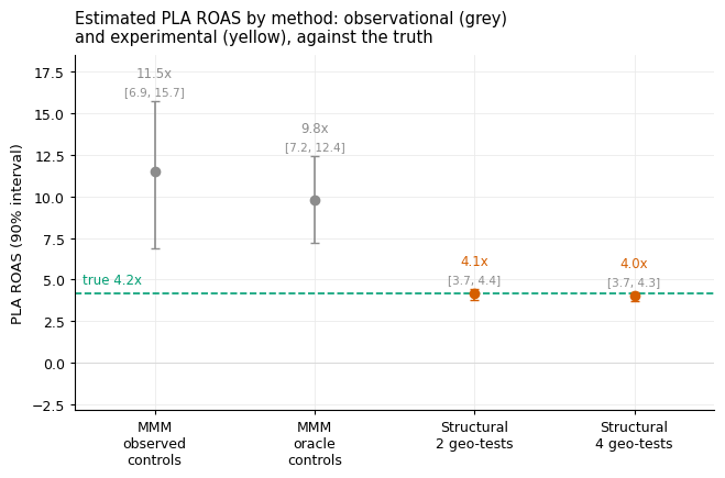
Placing this post’s estimates next to the previous post’s completes the argument: the same synthetic world, the same true return, and two routes to estimating it. Each estimate carries its posterior mean and 90% interval directly in the figure.
Two experiments already produce an accurate point estimate — 4.1x against a truth of 4.2x — and four tighten the interval further. The observational model, with three years of weekly data behind it, remains confidently wrong. The contrast is not about the amount of data — 156 weekly observations against 64 — but about its content: the observational weeks contain no variation in spend that is independent of demand, and the experimental weeks contain little else.
Next steps
The method is developed, and on synthetic data it works. What does that mean for a company that is building a MMM — and runs, or could run, geo-tests? There are three pragmatic routes, in increasing order of ambition.
The first two need nothing beyond this post. If geo-tests exist for every channel, the approach here is already the whole answer: estimate \((\alpha, \lambda, \beta)\) channel by channel, and every parameter the MMM needs for budget optimisation comes from experimental variation. If geo-tests exist for only some channels — the common case — estimate those channels here and hand the results to the MMM as very narrow priors, so that they stay essentially fixed while the MMM estimates the remaining channels from observational data.1 The caveat of the previous post applies with full force to those remaining channels: where spend is endogenous — and in any well-run company it is — their estimates remain uncalibrated correlations.
The third route is full integration: enter the differencing equation into the MMM’s likelihood, so that the experiments inform carryover and saturation jointly with the observational data. This is the natural extension of the lift-based calibration described in the introduction — where pymc-marketing’s add_lift_test_measurements enters one number per test into the likelihood, an add_lift_test_timeseries would enter the entire weekly path of the gap.2 The paper develops this combined estimator; an implementation in pymc-marketing is on my to-do list.
Designing geo-tests for calibration. All three routes work better if the experiments are run with calibration in mind, and four design choices follow from the mechanics above. Measure and keep the cooldown, for at least as long as the plausible carryover: the gap-closing weeks are where \(\alpha\) is identified. Stagger tests over time, or run them deliberately at different spending levels: saturation is identified by comparing gaps across levels, not by repeating the same test. Make the pre-period at least as long as the adstock memory, so that the gap-opening transition is fully usable. And archive the weekly series for both groups, not only the headline lift: everything in this post was estimated from the weekly path, and none of it survives the summary.
Conclusion
The series set out to answer one question — whether a Marketing Mix Model can recover the true returns to marketing — and the answer now has three parts. On realistic observational data, it cannot: for PLA — the channel where spend is most endogenous, because automated bidding raises it whenever sales run above their recent average — the estimates were confidently wrong, and better controls could not repair them. The reason is identification, not implementation: when spend responds to demand, nothing in the data separates the sales that caused the spend from the sales the spend caused. And the repair is experimental variation, used in full: two to four geo-tests of a kind many retailers already run, analysed through the model’s own equations rather than compressed into a lift number, recover the response curve and the return with useful precision.
Two caveats belong next to the result. The simulated experiments inherit the usual assumptions of any geo-test — a clean split, no spillovers between regions, no competitor reacting. And, as in the earlier posts, the estimator was handed the functional forms that generated the data; with real data, nobody guarantees that geometric adstock and logistic saturation are the right shapes. Beyond that, the argument is complete. The experiments were already being run, and the information was already in them; all this post did was decline to throw it away.
References
Heusch, N. (2026). Structural Estimation of Marketing Mix Model Parameters from Geo-Experiments. https://arxiv.org/abs/2608.21128
Jin, Y., Wang, Y., Sun, Y., Chan, D., & Koehler, J. (2017). Bayesian Methods for Media Mix Modeling with Carryover and Shape Effects. Google Inc.
Zhang, Y., et al. (2024). Media Mix Model Calibration with Bayesian Priors. Google Research.
Gordon, B. R., Zettelmeyer, F., Bhargava, N., & Chapsky, D. (2019). A Comparison of Approaches to Advertising Measurement. Marketing Science, 38(2).
Vaver, J., & Koehler, J. (2011). Measuring Ad Effectiveness Using Geo Experiments. Google Inc.
Note: All data in this post is synthetic; see the first post in the series for the generating process and the accompanying disclosure.
Footnotes
If the MMM implementation cannot take priors for individual channels, there is a rougher shortcut: compute the tested channels’ weekly contributions from the estimated parameters, subtract them from sales, and estimate the MMM on the residual outcome with the untested channels only. This ignores the uncertainty of the first stage and should be treated accordingly — but if a decision must be made today, it beats an uncalibrated MMM.↩︎
The division of labour is then clean: the observational weeks do what they are genuinely good for — baseline, seasonality, the untested channels — while the experimental weeks identify the causal parameters of the tested ones.↩︎